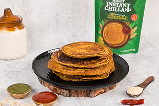


For Millet Matters, a health-forward millet-based FMCG brand, Touchwood Team delivered a vibrant and story-driven product photoshoot that reinforced the brand’s identity. Our approach focused on creating lifestyle imagery that positioned millets as both modern and wholesome.
What is the problem we solved for Millet Matters?
Millet Matters came to us with a clear brand purpose—reintroduce millets to the modern kitchen—but lacked the visual storytelling needed to resonate with today’s health-conscious audience. The challenge was to create content that wasn’t just aesthetically pleasing but also clearly communicated the brand’s promise of healthy, vibrant, and contemporary millet-based eating.


We solved this by crafting a photoshoot strategy that brought their brand to life through vibrant, purposeful visuals. Each product was captured in three key formats—flatlay, lifestyle + packaging, and cooked presentation—allowing us to showcase not only the versatility of the products but also the experience they offer.


Our photos highlighted:
-
The clean-label appeal of their products through minimal, wholesome setups
-
The modern-day relevance of millets through stylized, everyday food moments
-
The vibrancy and goodness of the ingredients, reinforcing brand identity


In doing so, we didn’t just give them photos—we gave them visual proof that Millet Matters belongs on shelves, screens, and in homes of mindful eaters. The final output made the brand pop while staying true to its rooted, nutritious core.

